Video Streaming · Creator Economy · Web App
Vibeo
A video streaming platform where you earn while you watch — and creators get paid for the audience they build
- Role
- Product Designer
- Team
- Freelance project
- Timeline
- 2 months · 2025
- Platforms
- Responsive Web
- 0
- Sides, one platform
- 0
- Dashboard, whole business
- 0%
- Numbers made legible
viewers who watch & earn, creators who earn
growth, audience and earnings in one view
charts that answer, not just display
01 — Overview
What if the time you spend watching was worth something?
People spend hours a day watching video and get nothing back for it, while the platforms and a handful of big creators keep all the value. Vibeo starts from a different premise: viewers earn small rewards for the time and attention they already give, and creators earn from the audience and engagement they genuinely build — not just raw view counts.
That makes it a real two-sided product. If viewers don't feel the rewards are meaningful, they don't stay. If creators can't see the audience and money they're building, they don't post. I had to design so both sides felt like they were winning — the watch experience for viewers, and a dashboard that makes a creator's whole business legible.
The problem
Viewers give their attention for free and feel it's worth nothing; creators can't easily see whether their channel is actually growing or where the money comes from. Neither side feels the value they create.
The goal
A streaming platform where watching earns viewers real rewards, and where a creator can open one screen and understand their growth, audience and earnings without a spreadsheet.
My role
A freelance engagement across the whole product — research, the viewer and creator flows, the creator dashboard and data-viz, and the design system, over roughly two months.
02 — Process
Designing for two people at once
A two-sided product is easy to get lopsided, so I kept moving between the viewer and the creator the whole way through. I started with the reward loop that ties them together — watch, engage, earn — and only then designed the screens on each side, checking every decision against 'does this still feel fair to both?'
How the work went
- 1Map the reward loop
- 2Viewer: discover & watch
- 3Creator: dashboard & earnings
- 4Design system
- 5Validate both sides
03 — Approach
Make the numbers say something
Headline first
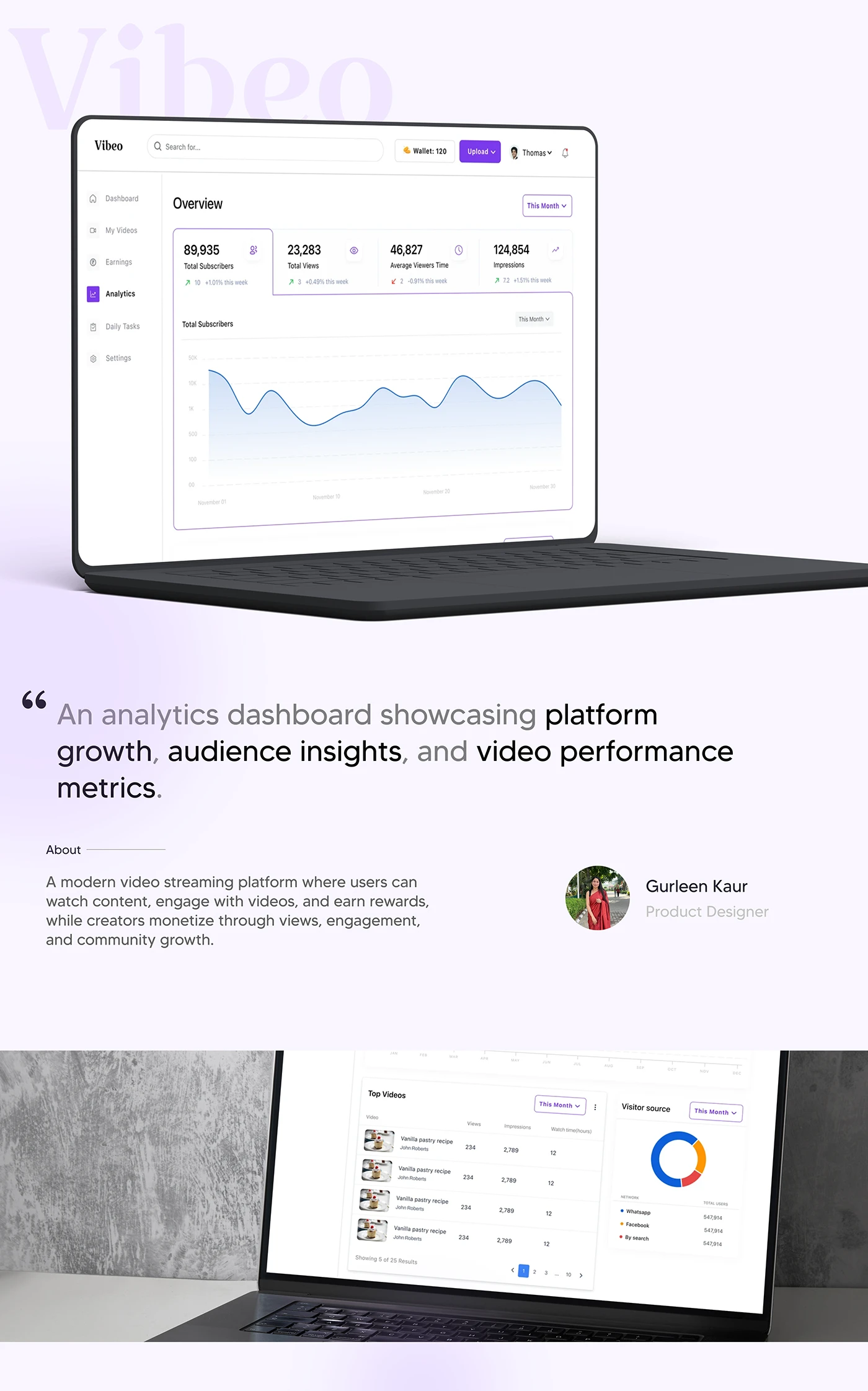
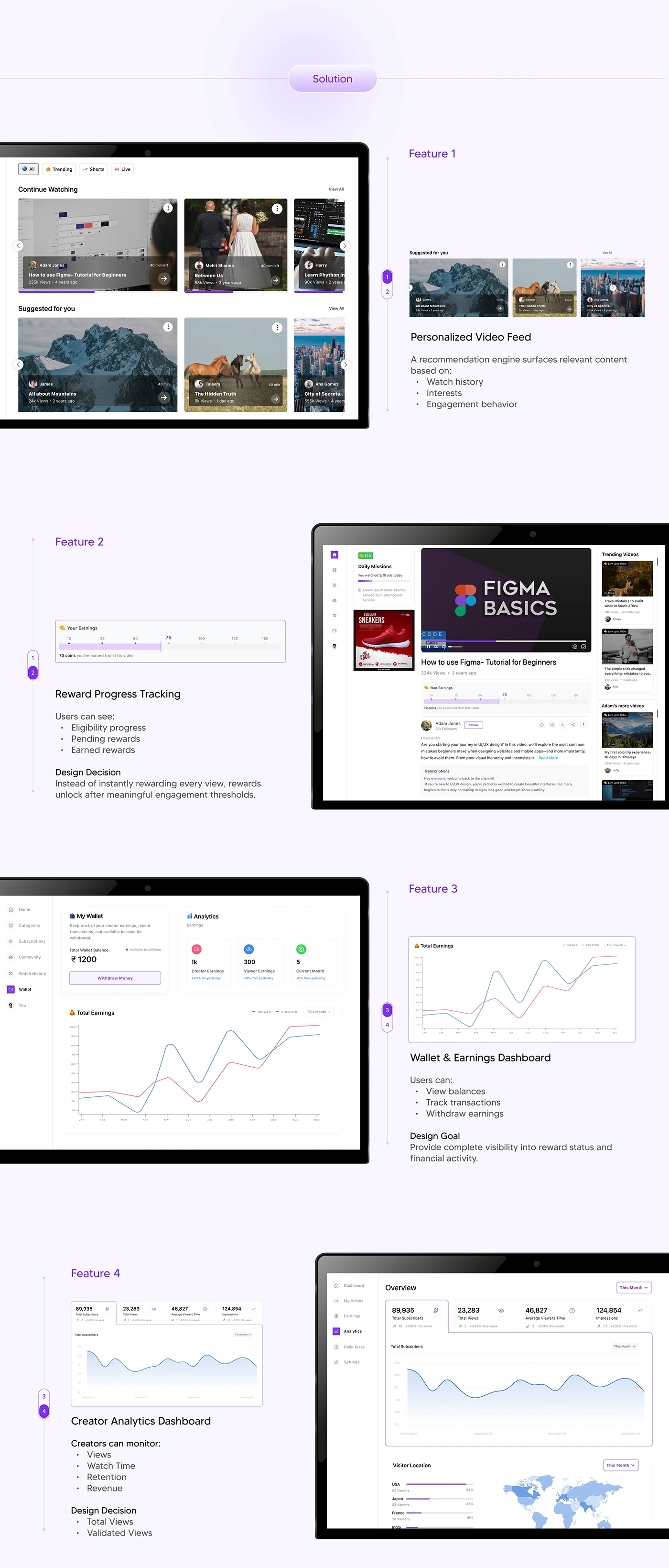
The four numbers that matter — subscribers, views, watch-time, impressions — sit at the top with their trend, before any chart.
Charts that answer questions
Every graph is tied to a question a creator actually asks: is my audience growing, which videos are working, where are they coming from.
Calm, confident, a little playful
A friendly violet system that feels modern without turning a serious tool into a toy.
04 — The case study
The full walkthrough
A few pieces of the case study below — the watch experience, the creator dashboard and the deeper reporting. The full deck lives on Behance.

05 — Reflection
What this one taught me
Two-sided means two problems
Every screen had to be fair to both the viewer and the creator. The moment I designed only for one, the other side quietly broke.
Data viz is editing, not decoration
On the creator dashboard, the win wasn't prettier charts — it was deciding which numbers earned a spot up top and which ones could wait.
Next
I'd want to test the reward loop with real viewers and creators — does 'earn while you watch' actually change behaviour, or just sound good?
Want the full walkthrough — decisions, dead ends and all?